

The Minimal Branding Trend
We've been hearing a lot more of the phrase 'less is more' in recent years, and the minimal branding movement is on trend in a big way. The essence of minimalism is indeed 'less is more' where there is more beauty in simplicity, and there is an appreciation for clean and simple lines, colours, and graphics.
As a movement, minimalism isn't too old, as it only began surfacing in the mainstream in the 60s and 70s, but its aim is simple: to filter something to only the essentials and necessities, stripping it of any excessive features or components.
But how does minimalism relate to your brand, your website, and your business? Here's what you should know about the minimal branding trend and how it can relate to you:
What is minimalism?
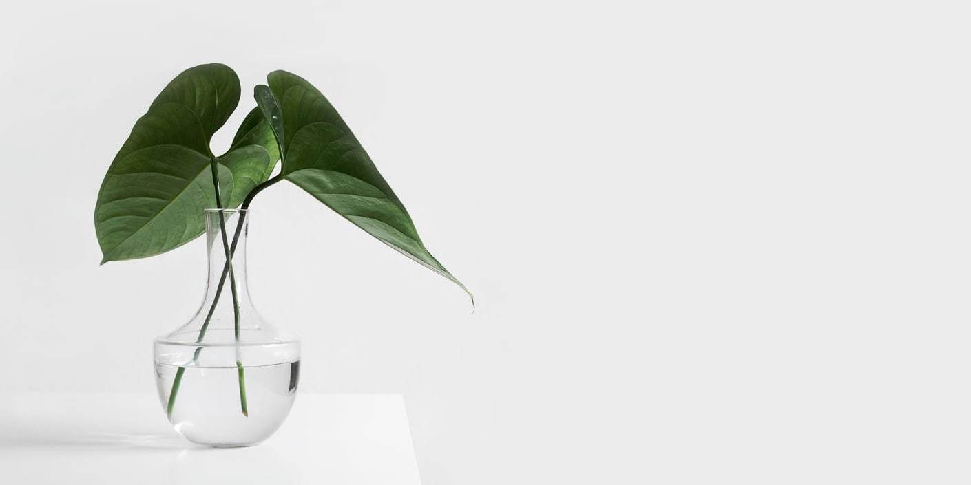
It is the distillation of a product, subject, or work of art down to the bare essentials, where we can then see the product, subject, or work of art’s true form. Minimalism is where space, colour, and form are reduced to their ultimate simplicity so they can attain their essential – their true – nature. Real minimalism is a form of nirvana in design, where all the excesses are removed.
We can’t really discuss minimalism without relating it to Scandinavian design, as the aesthetic behind Scandinavian design focuses on minimalist staples such as clean compositions and lines, functionality in design, natural and bright lighting, colours which are more neutral and lighter in hue, and natural flooring. In the same vein, a discussion on minimalism wouldn’t be complete without reference to Japanese Zen philosophy, where calmness, simplicity, and cleanliness are revered.
Minimalism in design

Minimalism is seen and used in different aspects, including web design and interior design. In web design, there is what is referred to as 'flat design' and this design leans more towards a kind of '2D' aesthetic in app and site user interfaces.
In flat design, depth is removed, and colours and shapes are emphasised. For instance, the buttons which your users can tap or click on wouldn't have any gradient or shading, and instead, will have stark contrasts in colour and lines, and edges which are well-defined.
Google has made its own contribution to minimalist web design with its material design, a language based on tactile reality philosophy and inspired by paper and ink fundamentals. This brings the design to its bare bones, therefore making the user more appreciative of the entire simplicity of the platform. Think of the design of various Google interfaces and platforms, including Google Drive, Gmail, Google Plus, Google Photos, and Google Maps.
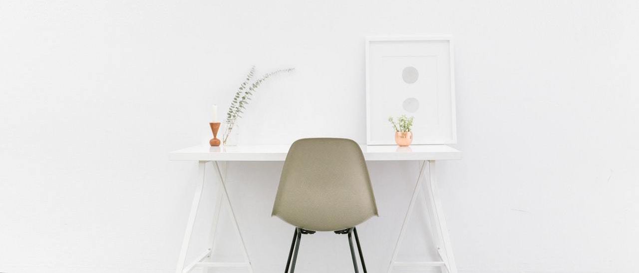
In interior design, you can see minimalism in surfaces which have no clutter – where there is a place for everything, and everything is in its place. You can also easily see minimalism in interior design through neutral or light-coloured bases and consistent tones and textures.
If you're keen on minimalism or any particular design aesthetic, find a web designer you're confident can deliver the look and feel you're after and have a good look through their portfolio. Of course, it's not just about the look of the work they've done; you also need to consider platforms and build processes, as well as practicalities like pricing and locality.
If you ended up here by searching for web design in Bristol, you've come to the right place. We're a local Bristol web design company who love working with other local businesses, creating professionally designed websites in all kinds of styles. Take a look at our local portfolio to see what we've recently created, or view our website packages to get an idea of our affordable pricing. You can also get in touch with our friendly team to find out more.
Share this post: