

The True Benefits of Responsive Website Design for Your Business
When people talk about responsive web design, there are plenty of explanations, which tend to make the concept more complex than it really is.
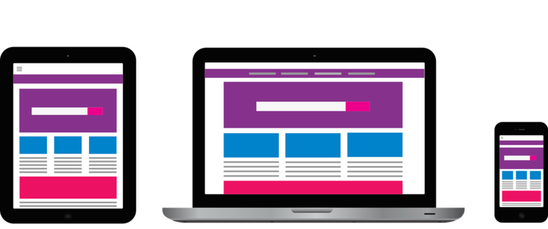
But in its essence, responsive website design is this: a means of making different websites adapt to the actual size of the user’s viewing portal, whether it’s a mobile phone, tablet, desktop, or laptop. That’s all it really is, and by this explanation alone, we can understand how important responsive website design is.
The most basic goal of responsive web design is to optimise the user’s experience when they visit a website, as the content of the website adapts to their device. This means that websites can load as quickly as possible and users don’t have to manually adjust or resize the content they are viewing. But there are other benefits brought by responsive web design as well. Let’s find out what these true benefits are.
Improving traffic to your website
In 2015 alone, over half of the traffic which went to the most popular websites came from mobile gadgets. This means only one thing: it’s important for a business to have a website which can properly render on small screens, allowing users to benefit from clear (and not distorted) images and experience an optimum layout. Responsive web design is the new normal, especially for businesses which want to have better versatility resulting in better traffic to their sites.
A better value for money package
It definitely gives more value for money to make a single responsive site compared to making a traditional desktop site plus a stand-alone site which is mobile-friendly. Even if it may cost a bit more to invest in a responsive website at the onset compared to the creation of two websites (one for mobile and one for desktop), you will still end up spending less money in the long run in terms of the cost of maintenance, the cost of configuration, and so on.
Low requirements for maintenance
If you try to maintain a separate site for mobile, this will require extra support and testing, and this is a fact our web design company in Bristol can easily confirm. But responsive web design makes use of standardised methodologies for testing so that every screen has an optimal layout. And if you have separate mobile and desktop websites, this will require two strategies for content, two interfaces for administrative purposes, and two (potential) teams specialising in design. The thing about responsive web design is that it offers a ‘one size fits all’ concept, which means fewer headaches for you and your developers – and, ultimately, fewer headaches for your clients. By not spending too much time on maintenance, you can also free up your time to concentrate on more essential tasks, such as the creation of content and marketing.
Responsive Web Design by it'seeze Bristol
At it'seeze Web Design Bristol, we specialise in creating professionally designed, fully responsive websites for local businesses. If you'd like to learn more about how responsive web design could help your Bristol business, contact us today.
Share this post: