Top Ten Tips for Ecommerce Website Design
If you want your website visitors to turn into paying customers, then the right ecommerce website design is integral to your success. Your site should be designed in such a way that the purchasing process is quick and easy, safe and as free from hassle as possible.
Even if you have the most aesthetically pleasing website and your online advertisements are 'right on the money', you could still lose customers if your site isn't geared for online sales.
This is where excellent ecommerce website design comes in. Here, then, are the top 10 tips for ecommerce website design which can lead to a tremendous increase in profit for your business:
1. Know your user
Details count. Every detail, from the images of your products to online forms, can have a tremendous impact on a visitor’s decision to move forward and make a purchase.
Know your user and bear them in mind at every turn. Your users’ experience can affect their decision to stay and buy your products.
2. Keep it simple
Simplicity is key in ecommerce, and a minimalist website is the way to go. A minimalist website is more appealing in visual terms, and it looks more trustworthy as well.
You can begin simplifying your site by having a close look at the information provided– is it truly necessary, or is it just fluff?
3. Make use of the 'view cart' icon

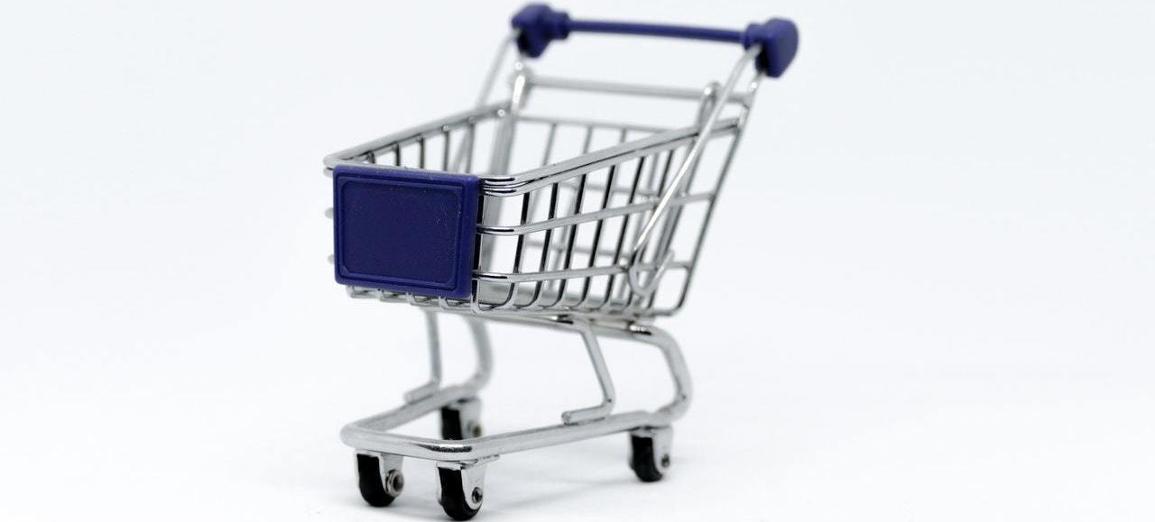
Many of the most successful ecommerce websites will have a 'view cart' icon, a little symbol on top of the page which allows visitors to view the items they have in their shopping basket.
This icon is vital to your website's success, as it has already been proven to enhance conversion rates. Stick with an icon that's simple and easy to understand, such as an image of a shopping cart or a bag.
Here's another tip: use a bright colour for the icon so your visitors can easily distinguish it when they're performing a transaction.
4. Don’t be sneaky with pricing
The term 'honesty is the best policy' is all too true in ecommerce. Remember to be straightforward and upfront with your pricing, and don't make it challenging for customers to find the pricing of your products.
The same goes for shipping – be clear about shipping costs at all times and display your shipping information early on.
5. Don’t overwhelm visitors with too much information
The aim of your ecommerce site is simple: to get visitors to make a purchase, thus generating sales for your business. But whilst it may be tempting to add information and details about your brand or give customers more info about your history, try not to overwhelm them with too many unnecessary details.
You should help them get through the purchasing process as quickly and efficiently as possible, and not distract them with pop-up windows, videos, and so on.
6. Present high-quality images

Online shoppers like to see the products they are buying, just like brick-and-mortar shoppers. Even more so, in fact. If you want your visitors to continue with the buying process, make sure the images of your products are of the highest quality. You can even include a video or two.
Here's another tip: if you can, add an image of a person using the product; for instance, clothing is more appealing if people can see it worn by an attractive model. Use images to your full advantage.
7. Take advantage of testimonials and reviews
A significant number of shoppers online read reviews prior to making a purchase, and you should use this to your advantage as well. One particular strategy you can use is to include product reviews right under the description of a product.
8. Make use of a menu bar
A menu bar allows your visitors to quickly and easily browse through your website’s pages so they can find what they need. You should place this menu bar across all your pages, especially at the page's topmost portion.
Bear in mind, though, that you shouldn't load the menu bar with too many choices or options, either, as this can confuse your visitors. Stick to the 'keep it simple' rule.
9. Organise your products

If you want users to easily find whatever they are searching for, keep the products organised. Organise products into categories and make these categories easy to find on the menu bar. One great bonus with this is that it may even let your visitors catch a glimpse of a category they weren’t aware of prior to checking out.
10. Don’t forget the search bar!
Many shoppers will probably have a particular product in mind once they arrive at your website. If you have a search bar, you can let them quickly find that product, thus leading to better visitor retention.
The best place for your search bar would be at the top of the page, on the right-most portion.
We advise looking for an agency who offer a specific ecommerce package as it’s important to work with those who understand the true purpose of your website, rather than focusing only on aesthetics. And if you’ve been searching for web design in Bristol specifically, then you’re already in the right place - why not get in touch with our friendly team today to find out how it'seeze Web Design Bristol can help.
Share this post:


